Tamarind Chutney
Industry Design Project
Brittany Kuhl
Project Overview
While earning my UX certificate through Springboard, part of the curriculum was to complete an Industry Design Project. I was so excited to be paired with Tamarind Chutney for my IDP. TC share so many of my core values and I was eager to dive right in. In my initial call with co-founder Tanvi Bikhchandani, she expressed wanting to turn more of shoppers website browsing into tangible sales. Step one was evaluating their current website and how to make updates with features like visible customer reviews and a place to search products.
Who is Tamarind Chutney?
Tamarind Chutney, a sustainable, indian block printed clothing company was founded by two best friends, who care about what clothing is doing to the environment and the makers, but don’t want to give up style. They sell beautiful products, but more than that they care about how they are made. TC is committed to preserving India’s rich craft heritage and working with artists to ensure meaningful improvements in their livelihoods.

Taken from TC original website-
Integrity: To the craft and to our stakeholders. Treating our artisan partners with respect and dignity. Paying living wages and sharing earned income from product sales with artisans. Each of our garments uses at least one traditional craft. We source fabrics directly from our artisans, and are in the process of setting up long term partnerships with them for profit sharing.
Transparency: Price shouldn’t be a black-box. Sharing cost break-down for each of our products, so that all our customers know where their money is going. Visit our product pages to find out how much each of our garments cost.
Community: Our success lies in the success of our partner artisans. Contributing to their success through long term partnerships, capacity building and social development
Sustainability: Waste is a design flaw. We use natural fibers, azo free dyes, and strive to use every inch of fabric possible. If you have ideas on how we can be more sustainable, send them our way :)

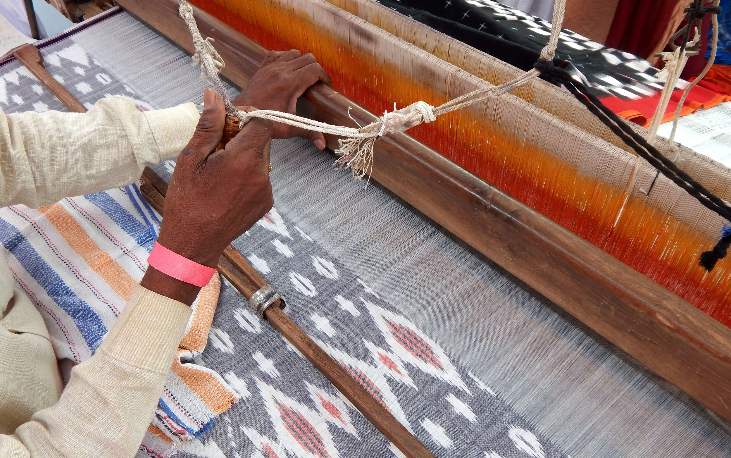
This is Zubeir. He is a 24 year old fabric craftsman from a small town called Ajrakphur in the Western part of India. His fabrics are sold to local retailers. Zubeir has been working as a hand block printer since he was 16. He creates traditional fabric called ajrakh which is native to the town he is from.
When owners of Tamarind Chutney have spoken to him in the past, Zubeir has told them that business is only good during the wedding and festival seasons, and that otherwise, his income is really unpredictable. He’s eager to service more orders, but he doesn’t have that option because of limited market access. He’s also expressed some troubling concerns about working with the buyers who source his fabric. In his own words, he has said,“Many buyers bargain for the last rupee -- even the ones who say they are socially responsible.”
Who shops at Tamarind Chutney?

Aditi, pictured here, is 26 years old and professionally working in Delhi. She is looking to wear everyday clothing made from the types of fabrics that Zubeir creates. She is excited about Indo-Western clothing that uses traditional prints to create contemporary styles. Though there are some Indian brands who have tried to operate in this space, she’s found that their sizing is inconsistent, the clothes are either too casual or too festive and the designs are geared towards an older generation. Dozens of other Indian millennials are feeling the same frustration with similar issues in the Indo-Western market.
Week 1
Scope and Timeline
After learning a little bit more about Tamarind Chutney, I broke down what I needed to do with a calendar on hand to get to the finish line of TC’s ultimate goal.
Working backwards and breaking it down by week here’s what I came up with.

It was important to make this timeline at the beginning of the process, so that both parties knew exactly what and when to expect it. I had to update the timeline during the course of the process as things always change, but it was great to have something to reference and to keep myself on track for my own deadlines.
Research and Competitive Analysis
After speaking with co-founder Tanvi Bikhchandani of Tamarind Chutney about the direction of where she wanted the site to end up, it was important to get more information about what is already out in the market and who the current TC consumer is. I did research and compiled a long list… (probably too long) of websites that had similar products, or the cool, trendy vibe that TC was going for. I sent it over to creators Tanvi and Charanya for review. After hearing their feedback about what they specifically liked and disliked from each site, I got started.
THE PROBLEM
Tamarind Chutney wants to not only make stylist, handmade, sustainable clothing but they also would like to especially sell enough to make a profit. This way, the artists and everyone involved would benefit. TC was having a difficult time actually turning what people had in their carts to purchase. A little bit of research and a redesign of the site should help create a more informative, user friendly space for customers to buy products.

You can see the product flow in the chart below bring the product directly to the customer instead of the use of multiple step process. Changing carts into sales is the ultimate goal.
HOW MIGHT WE….
Create a platform that looks trendy and updated?
Informs the users with enough but not too much information?
Turn carts into sales?
Stay on brand with TC vision?
Week 2
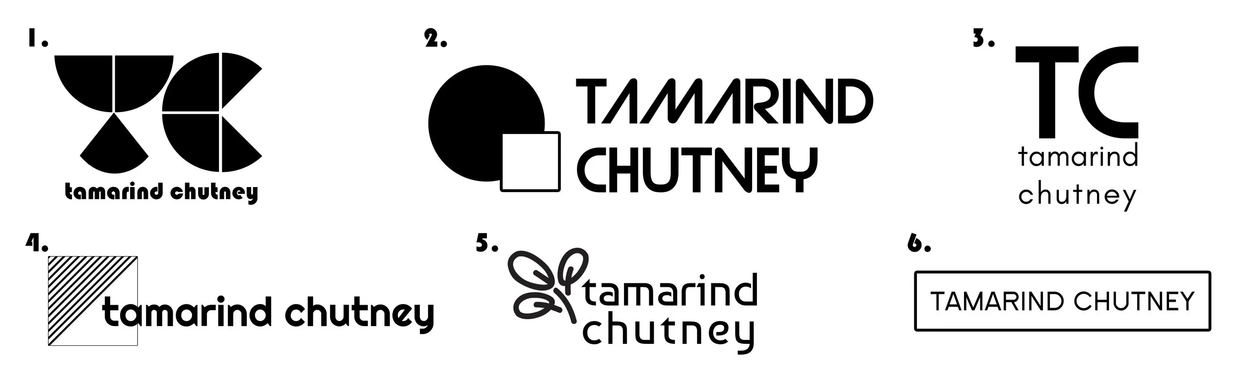
Here are some logos that I shared with TC to match their mood board.

THE SOLUTION
Design Direction
Mood Board, Logos and Style Guide
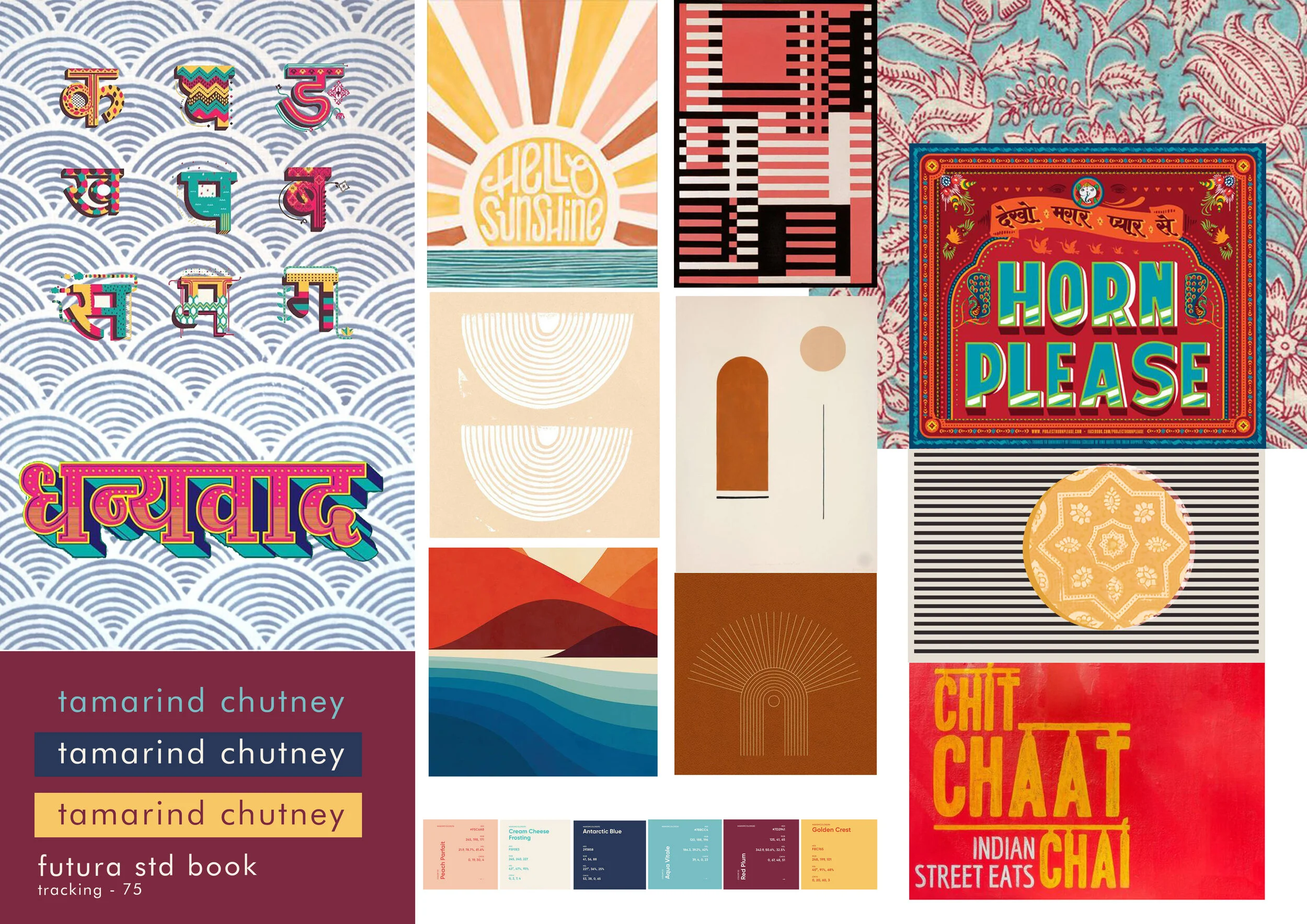
After doing some competitive research on what websites seemed successfully informative and stylish I wanted to speak with TC about the design direction they had envisioned. We actually had a little bit of a miscommunication which is typical in the design world. Sometimes using words can mean different things to people. I designed a mood board and style guide based on the direction I thought they communicated.
It’s funny, because after initially receiving this direction from them and running with it, it occurred to me that it was kind of an interesting mix of designs. Indian block printing is an ancient craft in which the imperfectness of it makes it beautiful, mixed with a clean, pop art meets Bauhaus. Seemed like a bit of an odd pairing, but I was up for the challenge. After sharing my mood board, style guide and logos with TC, I think they realized lines of communication got crossed somewhere and I missed the memo. They provided me with a new style guide in the direction of where they wanted to go. In my opinion, this direction was more suitable for their product line and on brand for who TC is. Lessons are always learned when communicating with a company or people, everyone’s style of communication is very different. I learned a lot, and especially realized that in hindsight, I should have asked for photos or references as a guide to make sure we were all on the same page. Luckily, in the end, it was no big deal and I enjoyed the process and quick pivots in giving TC exactly what they were looking for.
TC New Mood Board Reference
Week 3
Sketching Screens
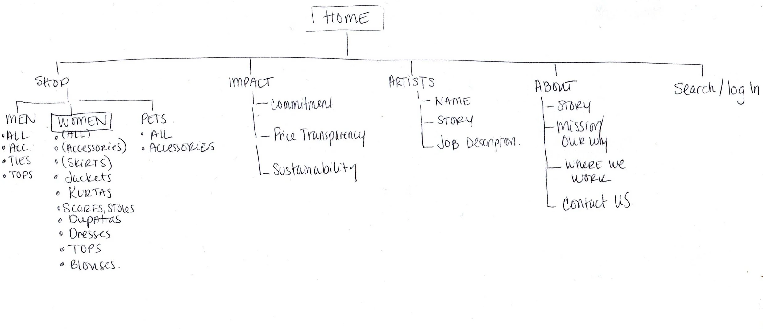
Website Category Flow Chart
After knowing the direction of TC and doing competitive analysis on what is out in the market, I sketched up some ideas for the Landing Page and Product Page. These sketches, as you can tell, are rough, but they get the idea across. I knew going into it, I would have to make some altercations. TC was changing over their website platform and instead of just designing something that they would have to try and recreate, I offered to design it into their websites platform. This way, I figured that I would know the boundaries and limits so that whatever I designed would actually be worthwhile for them in the end instead of pipe dreams.
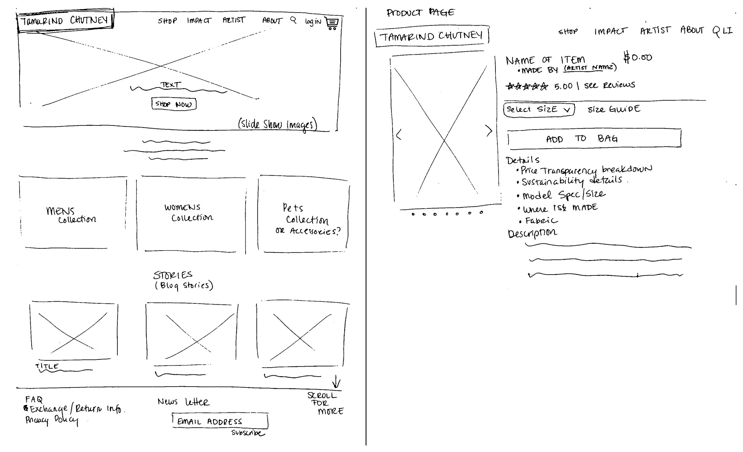
Landing & Product Page Sketch
Sharing my sketches with TC was helpful. This way, they had an idea and could see where the site was headed before I put hours of work into it. If they saw any glaring issue they could call it out before seeing the end result. It was important to also communicate to them that these designs can change depending on things like limiting factors of the site, verbiage being too lengthy and not fitting in a certain spot etc. But I was ready to get started
Week 4
Designing Site
Designing a few pages for TC was such a great learning process. I didn’t have previous knowledge of the platform that they were designing through- so I got to familiarize myself with the layout and process.. I definitely watched tutorials and learned somewhere along the way how to edit minimal codes to get the look and layout that I wanted. I also learned how powerful and important photos are for any site but especially on that is selling products. Based on my research, information and design direction from TC- this is what I came up with.
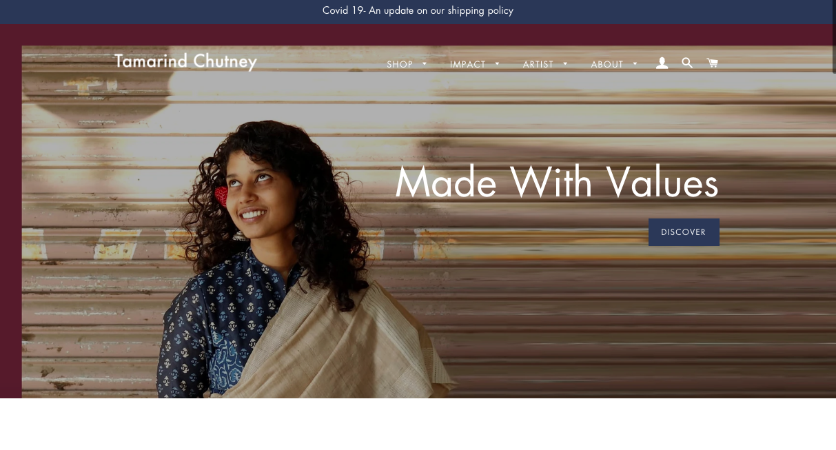
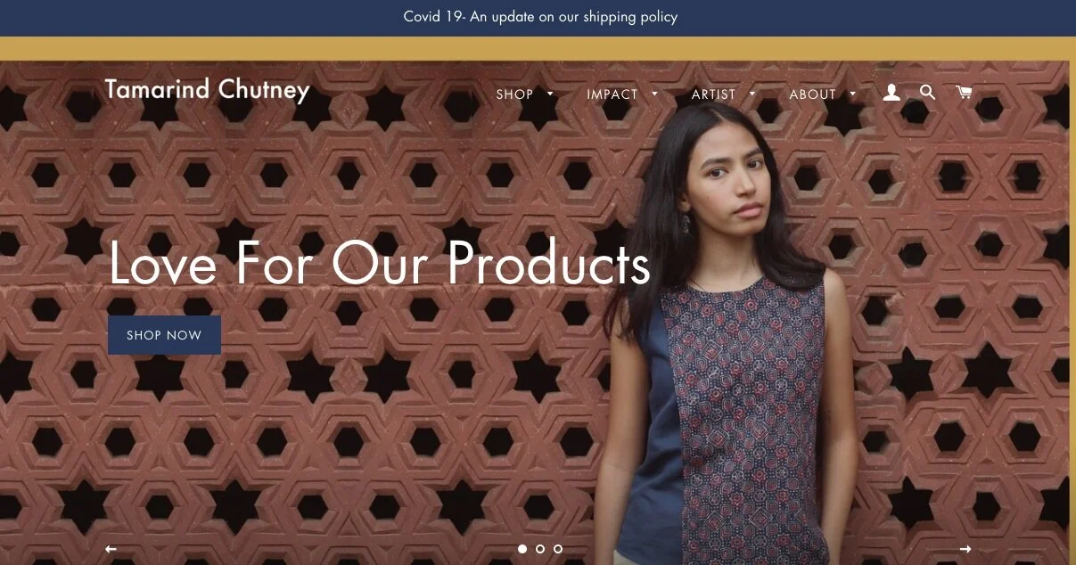
TC Old Landing Page
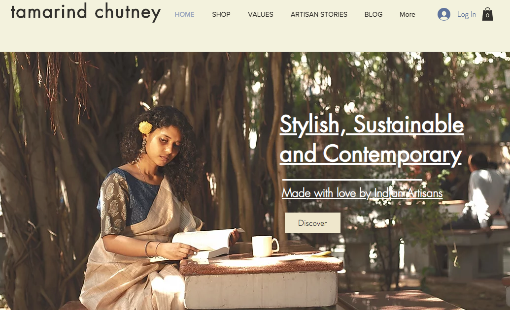
TC New Landing Page
I felt that the site needed an updated look. By adding photos and color that represents who TC is as a brand, it helped elevate the overall aesthetic. I felt that the top of the landing page would benefit from a slideshow format. The customer would then right away see a few images of the beautiful products and important information on a loop. More before and afters below.
Before- As you scroll down the landing page

After- As you scroll down the landing page

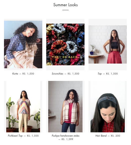
As the user scrolls down on the new site, they will not only see “what is new” but a collection of TC choosing. In this case, I named it “Summer Looks” as a placeholder. This collection can be updated depending on the season and products in stock.
TC has so much great information and fun ways they communicate with their community. I also loved some of their postings and wanted to showcase them more on the bottom of the landing page. I decided that the product should come first because that is what is most important for making sales and turning a profit. Engaging with the customer in the fun, energetic way that TC does, is next up in importance with connecting with the consumer.
How fun are these posts by TC? I love the informative and colorful way they communicate to their community.

As we all know, menu navigation is hugely important on the site for both the Header and Footer.

Showcasing what TC has as a brand is important as well as creating a smooth easy flow for the users to navigate. I created nested menus, so that the user could search overall collections like “Womens” or specifically jump to the “Blouse” collection.
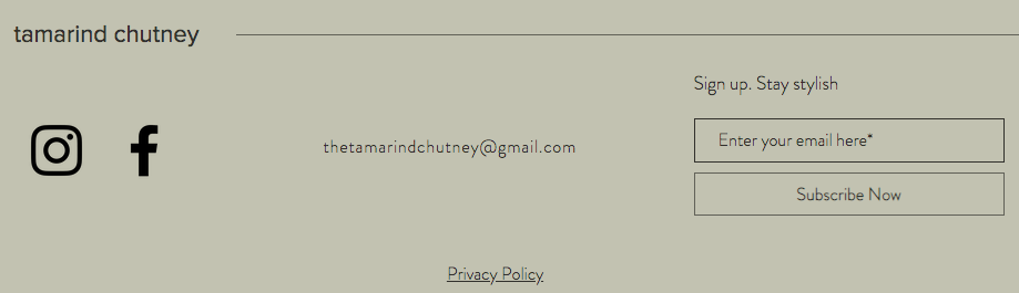
The next important menu of a site is the footer. Found at the bottom of each site, users can find important information about the brand like how to return something, or their privacy policy.

Now for the product page.

After reviewing TC’s old product page layout (above) there were some things that I wanted to edit to make the process more streamlined. I felt that things like shipping info, returns and refunds and composition and care could be found in a different more cohesive spot on the site. This way, there wouldn’t be so much information, overwhelming the customer. I liked the drop down guides that they had previously created and decided this was something that I wanted to carry over onto the new page given the amount of information needed for each product.

I felt it was important to add updated, trendy, focused on the product photos so the customer could see exactly what they were purchasing. After speaking with TC, we also decided it was important to add a customer reviews section on each product page. The consumer will be able to read up on what previous shoppers think about the product and how it fit. Reviews can be helpful when buying a product and can overall add to the customer and brand relationship.


Above you can see the drop down information on the product page more in depth.
I thought it was important to link the artist who created this garment. This promotes the artist, but also creates a greater connection and understanding between the customer and brand. They get more of an idea of what TC stands for and what values they are committed to.
TC also requested a price transparency section on each individual product page, breaking down the cost of each part of the process.

In the image above is what the customer sees as they scroll down on the product page. As an online shopper myself, I have found this type of “You may also like” section useful.
Also notice… as the customer scrolls down the logo and menu at the top stays pinned! Proud of my minimal coding skills in this process. This small gesture is so important on a site. What happens if the customer forgets which site they are all as they are scrolling… and has to scroll all the way to the top or bottom to remember. What a pain! It is the little things that add up to make the user experience a pleasant process.
Week 5
Validation and Feedback
TC got back to me that they loved the design direction and didn’t have any additional edits. They were going to continue in the color palette and design direction with expanding their product line and information links on the site.
My Role
I learned a lot working with TC. As someone who has a background in textile design, you can only imagine my excitement while being paired with a company like Tamarind Chutney. I love their beautiful product and felt so lucky to work on something that I too am passionate about.
Takeaways
Communication is key! Asking for clarity and sharing digital images goes a long way!
White space continues to be important in making sites look updated.
Decluttering and streamlining information goes a long way.
Sketching a rough sketch is so helpful to wrap one's head around initial designs without wasting time.
Pictures and color stories help immensely to cohesively pull together a brand direction and website.