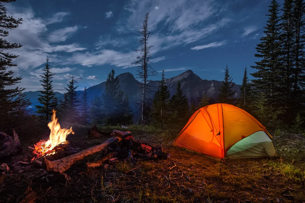
pitch
Studies have shown the positive effects of getting outside. With the use of technology, PITCH can help people reserve and access campsites in the outdoors efficiently.
THE PROBLEM
How PITCH was born
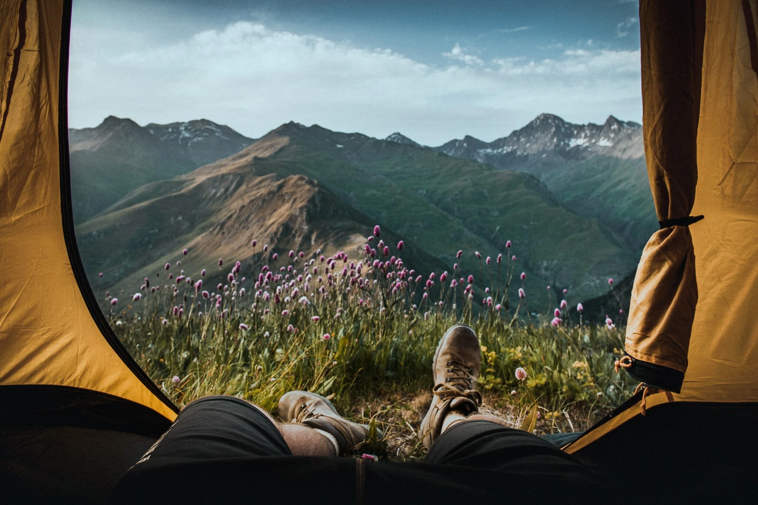
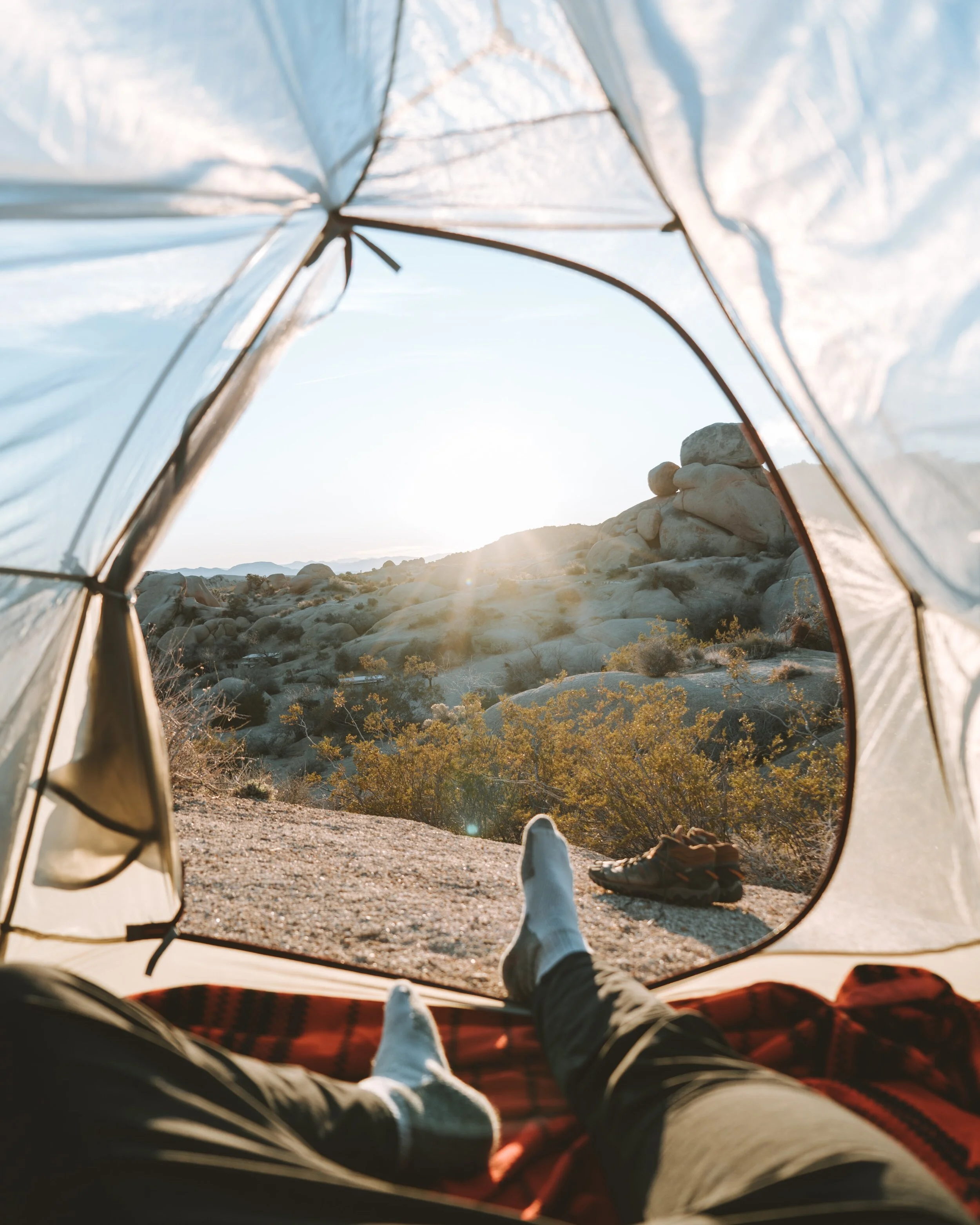
Over the summer I was away with some friends. We left over a major holiday weekend without much of a plan. The consistent and reliable access to our smartphones gave us the luxury of being flexible and on the go. We quickly realized how difficult it was to find a reliable website or app that gave us enough information and enticed us, through beautiful photos and useful maps for us to actually reserve anything. As I thought more about this...I wanted to see if this was true for others and if we shared a common pain point.
simple. streamlined. campsite reservations
THE SOLUTION
It was important that the solution to my problem would actually benefit the user and their experience. Therefore, research around what that information would be was necessary.
THE PROCESS
After doing secondary research about what sites/apps were already out in the universe, I made a plan.
I wanted answers to questions like…
How might we streamline the reservation/cancellation process for campsites?
How might we educate people about the outdoors?
How might we provide beautiful, serene, secluded, safe campgrounds?
How might we provide campsites as a tool as well for pleasure?
I gathered people to interview that would actually use a site like this in hopes that they would be able to give me the feedback and insight to move forward.
After multiple interviews and surveys, I was able to get an idea of who the PITCH user is. It seemed that there were 2 groups or types of personas that would use a camping app like this. One would use the app for convenience, for a place to sleep while trying to get from point A to point B. The other would use the app for pleasure, to plan a trip outdoors either while at home or on the go. I felt that it made sense to move forward with the persona that was seeking adventure for pleasure. This decision came from a greater percentage of this type of persona in my personal research. I also felt that the app could add more features for this type of user which would overall add value to the product. Choosing one persona to move forward with was important so that I was able to focus in and research one type of user so that they would be able to ultimately achieve their goals through PITCH.
Meet Sarah Jackson- #1 Fan and user of PITCH. Sarah wants to live in a world where it is easy to...
Book campsites
Find beautiful, secluded local outdoor spots
Get upfront information to make getting outside easier

UP NEXT
Compiling all the information from the interviews and surveys was an important step to knowing how to move forward. Using an affinity map helped to cluster all the similar feedback together.
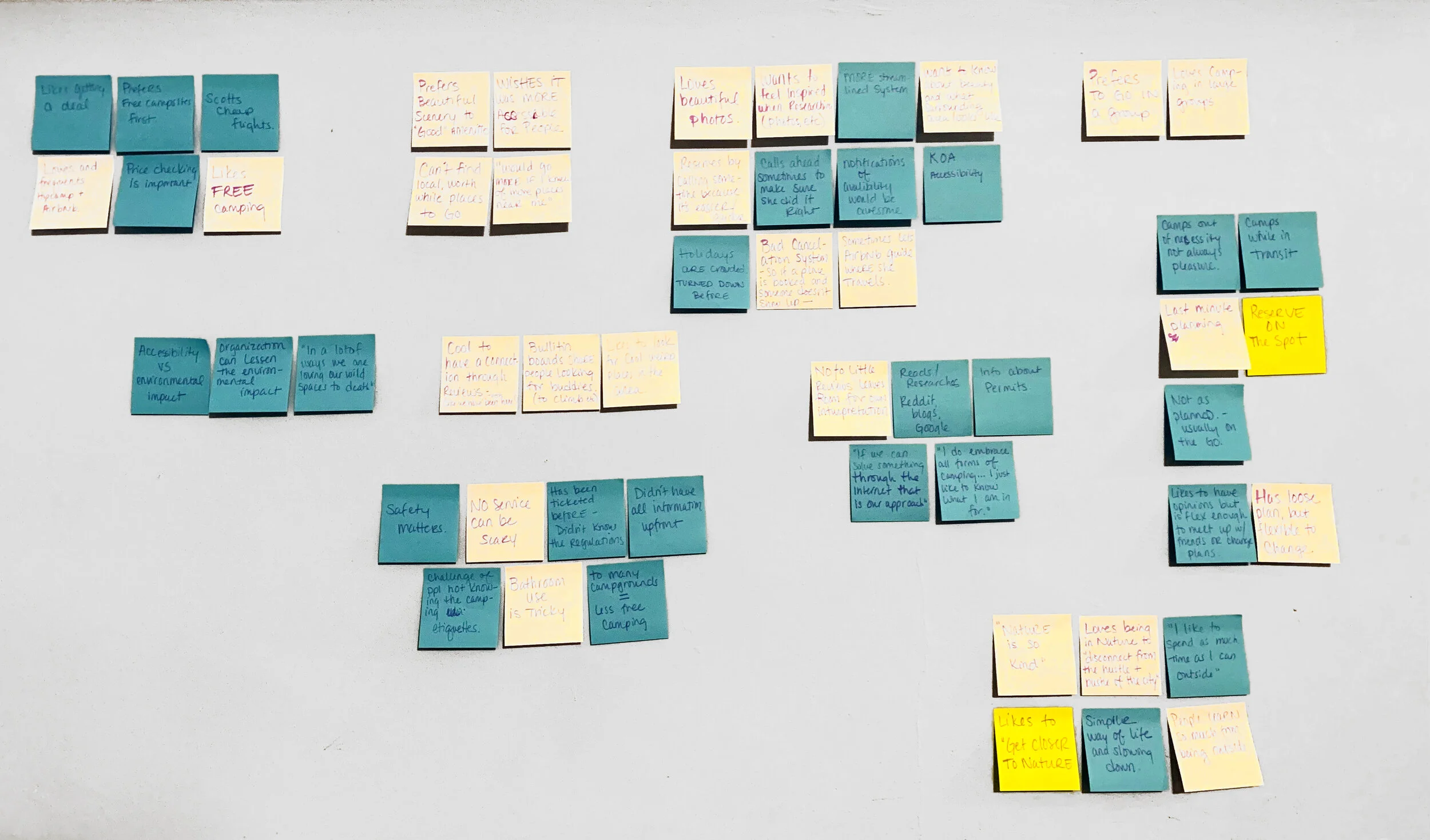
affinity map
After taking a look at what was most prevalent in the users thoughts and dialog, I created a user stories map in order to narrow in on what was most important.
Below are the MVPs (Minimum Viable Products) of PITCH. The information for these MVP’s came from research and information gathered in the affinity map above. They are the starting of a potential flow for the user to achieve their goals through the app.
The additional user flow ideas outside of the red box are other important features and flows that will be added to PITCH in a future update. They will overall add value to the app, but at this time, they were not crucial to the main goal of the user and therefore will be rolled out at a later date.

user stories
AFTER THAT...
I dove into the information architecture. From that came a flow chart of the decisions or pivot points a user would have to make while navigating the sign up and reservation process. I picked these two routes to navigate because I felt that they were the most important goals of the app to be achieved.
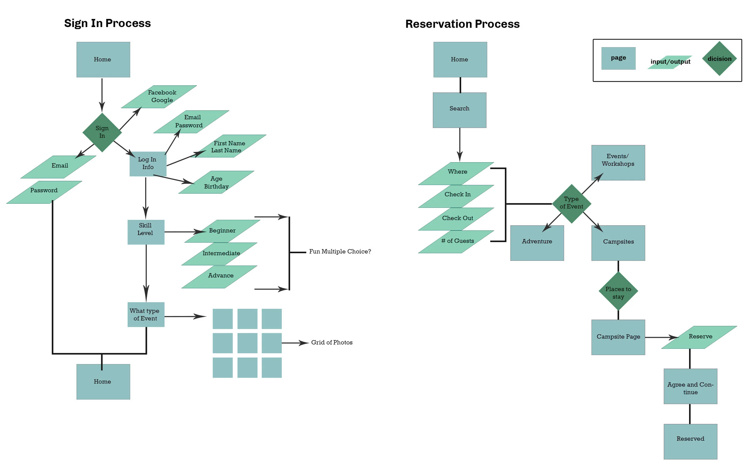
user flow
SKETCHES and WIREFRAMES
After coming up with a User Flow Chart, I started sketching. Here are some initial sketches I came up with to represent screens for PITCH.

The yellow markings in the sketches marks where the user would click to navigate the user flow.


In the images above you can see the evolution of sketches progress into a wireframe flow. This shows the placing of images and text on each significant screen.
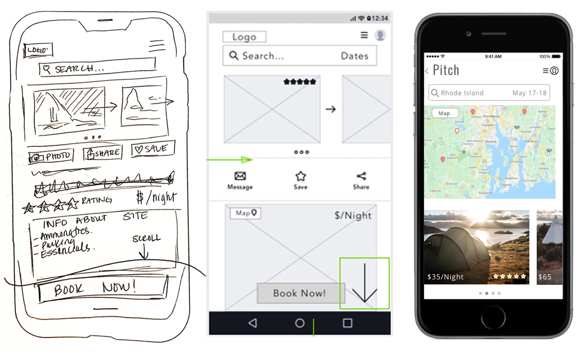
Above you can see the progression of sketch to wireframe to hi fidelity mockups. You will find that images and text were rearranged as I designed and tested further into the app.
DESIGNING
Before starting the design process of the hi fidelity mockups for PITCH I first wanted to create the mood of the app. I did this by pulling images together that I felt looked trendy, fresh, simple and fun. I knew going into it that I wanted PITCH to look clean and have a lot of white space.

You can see the mood board that I created for the design direction of PITCH. Once I actually compiled the images on the high fidelity screen I realized that almost all photos of the outdoors have consistent colors that can be found in nature. Not many camping photos would naturally have the salmon/coral color that is very dominant in my mood board. This was a point of learning for me while designing. It hadn’t crossed my mind that what is so important about the PITCH app is the clean look with beautiful photos of the outdoors. So as I was building the screens the color story changed. I was able to incorporate the coral color in small sections like the hearts shown above, but it didn’t end up being a main color, like shown in the original mood board.
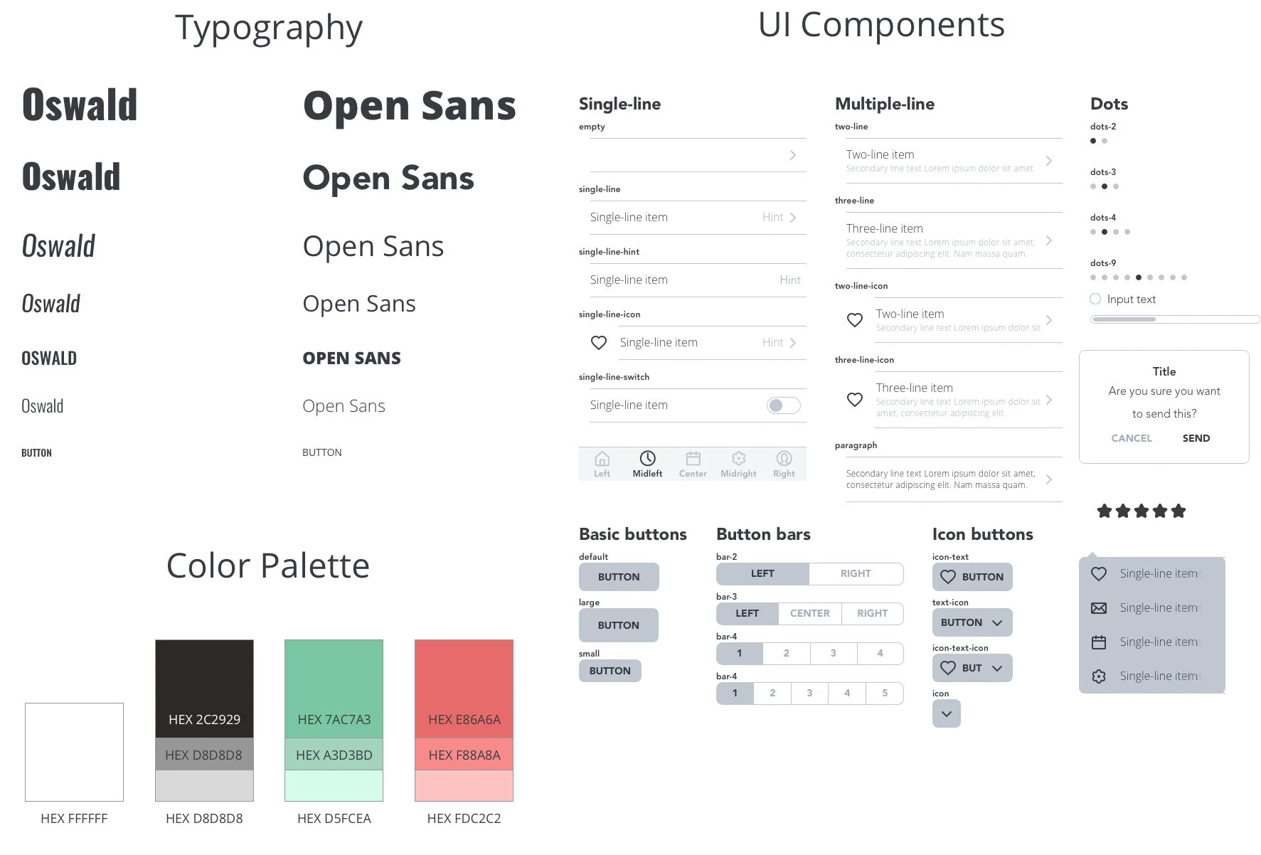
While designing it was also important to pull together the correct typography and UI elements for PITCH in a cohesive style guide.
TESTING
ROUND 1- Off to the Races
After creating screens it was important to get actual users to test it out. The first round of user testing was very insightful. Before testing,I had been the only one interacting with the app. It was helpful to see people try and navigate creating an account and reserving a campsite. Some main takeaways I received in the first round was as follows
Great photos
AirBNB for a camping vibe
Simple inviting style
Signing up is fun!
Needs an additional sign up tab
Users want to utilize a map early on in the process
Could use some streamlining in the process
After reviewing and revising the screens I sent it back out and tested 5 additional users.
ROUND 2 - The Refinement
Great photos
AirBnB vibe
Simple style
Search is a popular start for most users
Map is appreciated
Tweaks on username/sign up process
Some confusion/comments on the drop down
Take it for a spin! Prototype found here

MY ROLE in PITCH
I led all of the research and design for PITCH, since the start of this project in September 2019.
In the initial research phase, I set out to address user pain points related to gathering information and reserving a campsite. After researching the user, pain points and goals I moved on to the designing face and eventually, the testing of PITCH.
TAKEAWAYS
User research is important- without it, it wouldn’t be user centered design
It’s not personal- adapting designs and learning is part of the process! The change is necessary
It is important to remember the goals of the user in all steps- this will help to keep the design, research and process on track
People love the outdoors!
LET’S GET CAMPING!